


Log in
Latest topics
Who is online?
In total there are 3 users online :: 0 Registered, 0 Hidden and 3 Guests None
Most users ever online was 201 on Tue Dec 10, 2013 6:59 pm
Bearville

BC Gazette

Top posting users this week
| No user |
Top posting users this month
| No user |
Timezones
Pacific Time
Eastern Standard Time
Mountain Time
Central Time Zone
South Africa
United Kingdom
Atlantic Time
Copyscape

Critique? cx
+5
Cαтту☼
Sydney
Prism
Ally
Ashley✿
9 posters
Page 1 of 1

Critique? cx
![]() by Ashley✿ Tue Apr 22, 2014 5:24 am
by Ashley✿ Tue Apr 22, 2014 5:24 am
Since I couldn't log in at bv at the moment because our wifi is soooo slow..
I started to play with the tools in Photoshop & used some of my old photos
I used to do graphics a few years back but stopped and wanted to see if I still had the basics down and so I came up with this~
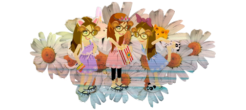
I'm not sure if it's good since other members' graphics are crazy awesome so...
YAY or NAY?

I started to play with the tools in Photoshop & used some of my old photos
I used to do graphics a few years back but stopped and wanted to see if I still had the basics down and so I came up with this~
I'm not sure if it's good since other members' graphics are crazy awesome so...
YAY or NAY?

Ashley✿- Baby Bear

- Warning :

Posts : 25
Tickets : 20
Join date : 2014-04-20
Re: Critique? cx
![]() by Ally Tue Apr 22, 2014 7:03 am
by Ally Tue Apr 22, 2014 7:03 am
That's a nice one since you didn't edit in many years.
I'd say it's okay but graphics are not only about just making up with colors and flowers. You need to add an idea to your graphics, something that makes sense. For example you could do a flower and your avatar as if rising from that flower you know.
Those 'crazy awesome' graphics you see on the forums are so because they have an idea on them. They are meant for something, are meant for you to understand something with them.
Here, as a viewer, from your graphic i could understand you wanted to show us the colors of the flowers/spring etc. But what does the move with popcorn do with it? You should combine both the moves and the clothings with flowers, instead put a flower cone move or another one and then later add a flower in your avi's hand.
Based on your graphic ,since you wanted critique i'd say that:
1) The red arrow: you need to not cut-off your work. Do not delete half of the flower's ends just to fit in the size. Make sure all the graphic is complete, not deleted on the edges.
2)The black circle symbolizes the central area of your graphic. That area (in your case) should be sharpened and outlined, as in marked the most important point from your graphic. Something that captures the viewer's attention.
3)The blue arrow symbolizes the colors + the lines on the flower petals. Try not to delete the lines, try to fade them in with the other colors. As for the clothings, use a color replacement tool and try to match/combine the colors you want the flowers to be with your avi's clothing. That will make a huge difference.

I've randomly made one so you can understand. See don't try to add many colors and shadows and sparkles etc at the same time
simple, flower , text c,haracter and your'e ready to go; See the blue arrow> the avi is sharpened and my general point of attention is to my character ready to drink a margarina coffee{it's made from flower petals}. The red arrow symbolizes the matching colors. As you see, try to use different shades of colors on your graphic. Not different colors. If you do want to use different colors, i'd advice you to look at the color wheel below, as every color from it combines perfectly 100% with any other. Those are the basic shades and general base colors.


As not trying to be harsch, just giving advices and ciritique since i see in you great potential and talent, and i want you to give your best of it. Try to add some shadows and sharpened elements along the graphics and you'll be good to go ; ]
I'd say it's okay but graphics are not only about just making up with colors and flowers. You need to add an idea to your graphics, something that makes sense. For example you could do a flower and your avatar as if rising from that flower you know.
Those 'crazy awesome' graphics you see on the forums are so because they have an idea on them. They are meant for something, are meant for you to understand something with them.
Here, as a viewer, from your graphic i could understand you wanted to show us the colors of the flowers/spring etc. But what does the move with popcorn do with it? You should combine both the moves and the clothings with flowers, instead put a flower cone move or another one and then later add a flower in your avi's hand.
Based on your graphic ,since you wanted critique i'd say that:
1) The red arrow: you need to not cut-off your work. Do not delete half of the flower's ends just to fit in the size. Make sure all the graphic is complete, not deleted on the edges.
2)The black circle symbolizes the central area of your graphic. That area (in your case) should be sharpened and outlined, as in marked the most important point from your graphic. Something that captures the viewer's attention.
3)The blue arrow symbolizes the colors + the lines on the flower petals. Try not to delete the lines, try to fade them in with the other colors. As for the clothings, use a color replacement tool and try to match/combine the colors you want the flowers to be with your avi's clothing. That will make a huge difference.
I've randomly made one so you can understand. See don't try to add many colors and shadows and sparkles etc at the same time
simple, flower , text c,haracter and your'e ready to go; See the blue arrow> the avi is sharpened and my general point of attention is to my character ready to drink a margarina coffee{it's made from flower petals}. The red arrow symbolizes the matching colors. As you see, try to use different shades of colors on your graphic. Not different colors. If you do want to use different colors, i'd advice you to look at the color wheel below, as every color from it combines perfectly 100% with any other. Those are the basic shades and general base colors.
As not trying to be harsch, just giving advices and ciritique since i see in you great potential and talent, and i want you to give your best of it. Try to add some shadows and sharpened elements along the graphics and you'll be good to go ; ]

Ally- Graphic Artist

- Warning :
Posts : 306
Tickets : 647
Join date : 2013-09-16
Re: Critique? cx
![]() by Prism Tue Apr 22, 2014 7:33 am
by Prism Tue Apr 22, 2014 7:33 am
Sorry off topic: What editor do you use Ashley?? <33333333
And I thimks its very niceee
And I thimks its very niceee

Prism- Grand Bear

- Warning :
Posts : 2742
Tickets : 1158
Join date : 2013-09-20
Re: Critique? cx
![]() by Ally Tue Apr 22, 2014 7:34 am
by Ally Tue Apr 22, 2014 7:34 am
Nadia wrote:Sorry off topic: What editor do you use Ashley?? <33333333
And I thimks its very niceee
She said in the description she used Photoshop. Adobe Photoshop.
Ally- Graphic Artist
- Warning :
Posts : 306
Tickets : 647
Join date : 2013-09-16
Re: Critique? cx
![]() by Ashley✿ Tue Apr 22, 2014 8:56 am
by Ashley✿ Tue Apr 22, 2014 8:56 am
Ally: Thanks for the advice! I really appreciate it c: I tried to do what you told me so I made a new one.. I'm not sure if it's any better but I tried to follow ((i hope)) what you said~
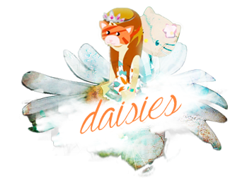
I tried to make her look like she was sitting on the flower ((although i'm not very sure if it's obvious)) it's not very original but I wanted to play with different textures cx I did what you said about not using too many colors so... lol wow i feel really embarrassed now

Nadia: Yeah like she said I am using Adobe Photoshop CS6 & thanks so much! c:
I tried to make her look like she was sitting on the flower ((although i'm not very sure if it's obvious)) it's not very original but I wanted to play with different textures cx I did what you said about not using too many colors so... lol wow i feel really embarrassed now
Nadia: Yeah like she said I am using Adobe Photoshop CS6 & thanks so much! c:
Ashley✿- Baby Bear
- Warning :
Posts : 25
Tickets : 20
Join date : 2014-04-20
Re: Critique? cx
![]() by Ally Tue Apr 22, 2014 9:54 am
by Ally Tue Apr 22, 2014 9:54 am
Now take a look at the difference


Id totally say the second one is a BLOWN UP. You just did it right there! Try to add more sharp to it ^^and if you made like a cloud underneath the text, add some more effects of the cloud along. Play with the colors, similar to this:

And as i said use colors from the coloring wheel, look what a big difference you can make:

in this situation i'd say the color redish>yellow is the base of your paint. Use it more often ;] and end up with a wonderfull result!
This is so much better than what i've expected!
Simple, yet fascinating. I adore it good job+++
Id totally say the second one is a BLOWN UP. You just did it right there! Try to add more sharp to it ^^and if you made like a cloud underneath the text, add some more effects of the cloud along. Play with the colors, similar to this:
And as i said use colors from the coloring wheel, look what a big difference you can make:
in this situation i'd say the color redish>yellow is the base of your paint. Use it more often ;] and end up with a wonderfull result!
This is so much better than what i've expected!
Simple, yet fascinating. I adore it good job+++
Last edited by Ally on Tue Apr 22, 2014 10:06 am; edited 3 times in total
Ally- Graphic Artist
- Warning :
Posts : 306
Tickets : 647
Join date : 2013-09-16
Re: Critique? cx
![]() by Sydney Tue Apr 22, 2014 10:00 am
by Sydney Tue Apr 22, 2014 10:00 am
Wow, I really like the second a lot. Good job!
Also, it's very kind of you, Ally, to give her so much advice. :]
Also, it's very kind of you, Ally, to give her so much advice. :]

Sydney- Trading Pawtrol

- Warning :
Posts : 2621
Tickets : 2630
Join date : 2013-09-17
Re: Critique? cx
![]() by Cαтту☼ Tue Apr 22, 2014 11:35 am
by Cαтту☼ Tue Apr 22, 2014 11:35 am
Whoa the second one is AWESOME!!
thx for sharing {YAY }
thx for sharing {YAY
}
Cαтту☼- Grand Bear
- Warning :
Posts : 2415
Tickets : 959
Join date : 2014-01-08
Re: Critique? cx
![]() by Ashley✿ Tue Apr 22, 2014 12:06 pm
by Ashley✿ Tue Apr 22, 2014 12:06 pm
Ally: You are so awesome I'm not even joking..  Thank you so much for all the tips and for all the help seriously I learned so much! I appreciate it, thank you <333
Thanks Sydney & Catty, means a lot to me
Thank you so much for all the tips and for all the help seriously I learned so much! I appreciate it, thank you <333Thanks Sydney & Catty, means a lot to me
Ashley✿- Baby Bear
- Warning :
Posts : 25
Tickets : 20
Join date : 2014-04-20
Ally- Graphic Artist
- Warning :
Posts : 306
Tickets : 647
Join date : 2013-09-16
Re: Critique? cx
![]() by amazingleah☆ Tue Apr 22, 2014 2:01 pm
by amazingleah☆ Tue Apr 22, 2014 2:01 pm
Wow, the first graphic is awesome, but the second one is amazing! Ally, you gave BRILLIANT advice, and now Ashley has a great graphic! <33

amazingleah☆- Reporter

- Warning :
Posts : 2848
Tickets : 2743
Join date : 2013-09-18
BananaAriana- Grand Bear
- Warning :
Posts : 1957
Tickets : 234
Join date : 2013-09-17
Hazza- Moderator

- Warning :
Posts : 54446
Tickets : 11407
Join date : 2013-09-17

*w*- Royal Bear

- Warning :
Posts : 413
Tickets : 365
Join date : 2013-09-17
» critique.... cx
» Critique? c:
» Critique Thread~~
» critique my drawing?
» tfios graphic x critique maybe?
» Critique? c:
» Critique Thread~~
» critique my drawing?
» tfios graphic x critique maybe?
Page 1 of 1
Permissions in this forum:
You cannot reply to topics in this forum|
|
|
» THIS SITE WAS TOXIC ***CHANGE MY MIND****
» Post before Abby posts (:
» MEANEST MEMBER OF BEARVILLE CITY CHECKKKK
» BC's Official Counting Post! *win tickets*
» BEARVILLE CITY RULES | Please read and agree before posting! | AS OF 3/9/14
» CaliLove's Admin Application! (hope I get chosen!)
» RED AND WATER ARE NOT ACTUALLY SISTERS (a thread)
» rate the siggie above you!